How to Choose Paint Colors for Small Rooms
Introduction
Choosing the right paint color can transform a room. In small spaces, this choice is even more critical because color affects how we perceive size, light, and mood. A poor color decision can make a compact room feel cramped and dark, while a well-chosen palette can create the illusion of spaciousness, airiness, and comfort. Since many modern homes and apartments include smaller bedrooms, bathrooms, and living areas, understanding how to select paint colors is an essential skill for homeowners, renters, and design enthusiasts.
This article explores the science of color perception, expert design strategies, and practical steps to help you choose paint colors that enhance small rooms.
The Science of Color Perception in Small Spaces
Human vision and psychology play an important role in how we experience space. Lighter shades reflect more light, making walls appear to recede, which visually enlarges the room. Darker shades absorb light, bringing walls closer and making spaces feel intimate but smaller.
Research in environmental psychology also shows that cooler tones—like soft blues, greens, and lavenders—tend to visually expand a space, while warmer tones—such as deep reds or oranges—make rooms feel cozy and enclosed. This isn’t just subjective preference; it’s connected to how our brains interpret reflected light and color wavelengths.
Understanding this science helps us use paint not just for decoration, but as a tool for spatial illusion.
Light and Its Interaction with Paint Colors
Lighting is one of the most influential factors in how a paint color appears. Natural light changes throughout the day, shifting tones in subtle ways. Artificial lighting—whether warm incandescent bulbs, cool LED lights, or daylight-balanced fixtures—can dramatically alter a color’s appearance on the wall.
In small rooms, maximizing natural light is key. Pale shades with reflective qualities help bounce daylight around, reducing shadows and creating a sense of openness. If the room lacks natural light, strategic paint choices, such as warm neutrals or soft pastels, can prevent the space from feeling stark or claustrophobic under artificial lighting.
Historical Perspectives on Paint in Small Interiors
Historically, small rooms were often painted in darker tones to emphasize coziness. In Victorian homes, for instance, parlors and studies frequently featured deep reds, greens, and browns, reflecting both the limited light sources of the time and cultural preferences for warmth and intimacy.
However, modern design movements—especially mid-20th-century minimalism—shifted toward lighter, airier palettes. White walls, pale woods, and clean lines became hallmarks of making even modestly sized spaces feel more expansive. Today’s design trends balance these traditions, encouraging homeowners to use both light-enhancing shades and bold accent walls to personalize small spaces.
Classic Strategies for Choosing Paint Colors
1. Stick to Light and Neutral Palettes
Whites, creams, soft grays, and pale beiges are timeless choices for small rooms. They reflect light effectively, reduce visual clutter, and make walls seem farther apart. Designers often recommend neutral backdrops because they allow flexibility in furniture, textiles, and decor.
2. Use Cool Tones for Expansion
Soft blues, mints, and lavenders tend to recede visually, creating a calming sense of depth. In bedrooms or bathrooms, these hues make compact areas feel more restful and larger.
3. Incorporate Accent Walls Thoughtfully
While small rooms benefit from lighter colors overall, a single accent wall can add depth. For example, a navy or forest green wall behind a bed can anchor the room, while the surrounding lighter walls keep the space open.
4. Try Monochromatic Schemes
Using varying shades of one color can create continuity and flow, reducing the choppiness that makes small rooms feel cluttered. A monochromatic palette of layered grays, for instance, can look both sophisticated and expansive.
How Color Psychology Shapes Small Spaces
Color affects not only spatial perception but also mood and functionality. For example:
- White and off-white: Clean, open, fresh; ideal for minimalist looks.
- Soft blue: Relaxing and airy; works well in bedrooms and bathrooms.
- Pale green: Refreshing and natural; great for kitchens or studies.
- Light gray: Sophisticated yet neutral; pairs with almost any decor style.
- Warm beige or sand tones: Inviting and cozy without overwhelming the space.
In small rooms used for productivity, such as a home office, light greens or blues can encourage focus. In small living rooms, warmer neutrals create comfort without feeling oppressive.
Practical Applications: Room-by-Room Guidance
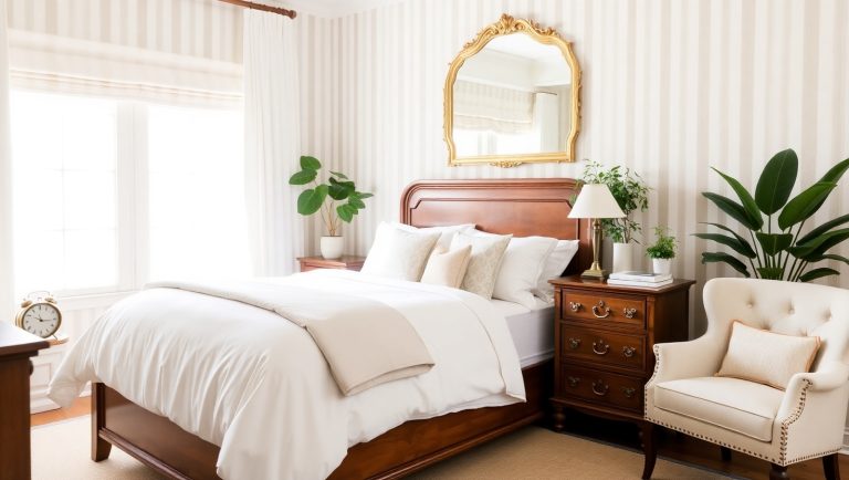
Small Bedrooms
Opt for light, calming tones such as pale blue, soft gray, or ivory. These shades encourage relaxation and make tight spaces feel restful rather than confined. Adding a darker accent wall behind the headboard creates a focal point without shrinking the room.
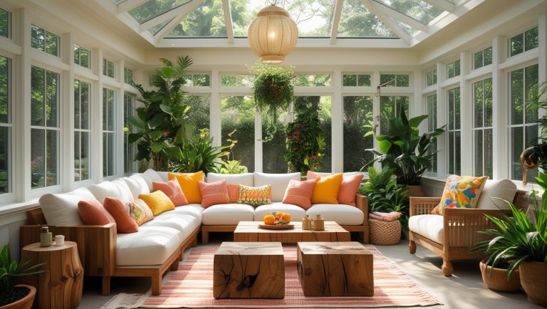
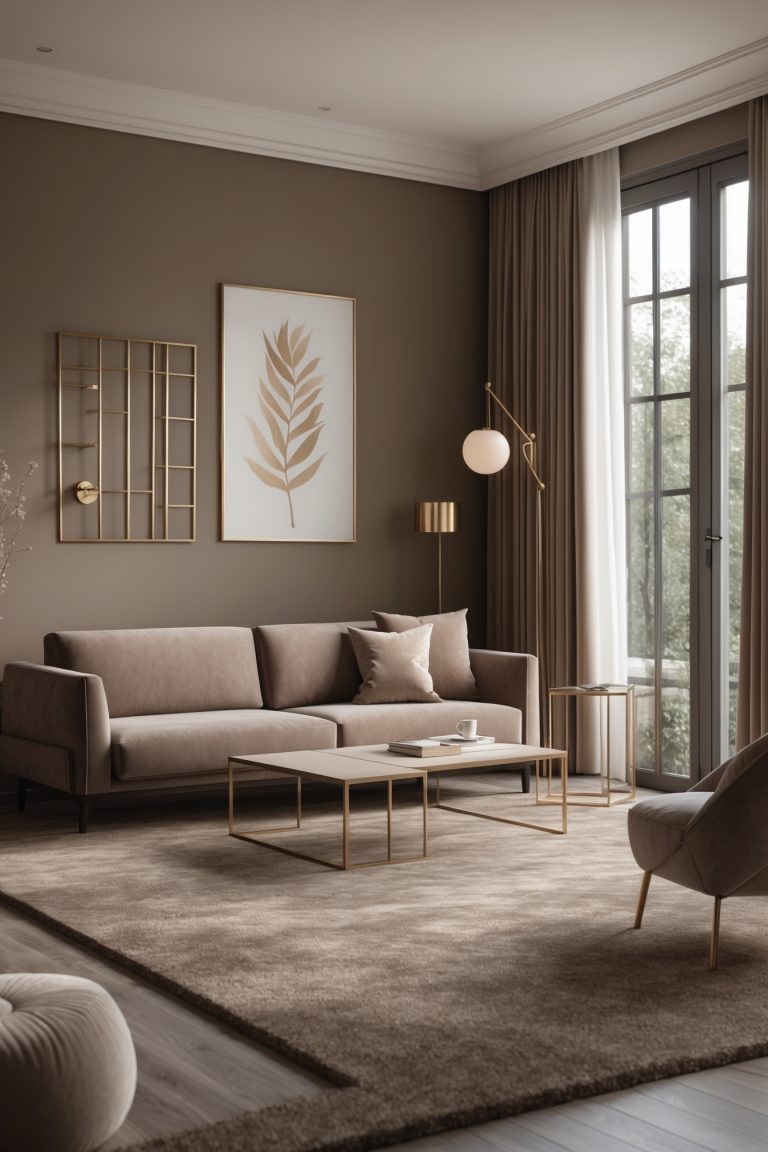
Small Living Rooms
Neutral bases like cream or taupe can make the living room versatile, while adding colorful accents through cushions or art. For bold personalities, a deep accent wall works well if paired with ample lighting and light-colored furnishings.
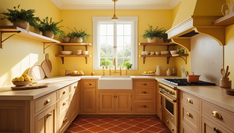
Small Kitchens
Since kitchens often lack large windows, lighter colors like soft yellow, mint green, or light gray can brighten the space. Glossy finishes can also reflect light, giving a sense of more room.
Small Bathrooms
Bathrooms benefit from light, airy tones. Pale aqua, soft gray, or even crisp white can enhance a clean and spacious feel. Adding a darker floor tile provides grounding without making the walls feel closed in.
Mistakes to Avoid When Choosing Paint for Small Rooms
- Overusing dark colors: One accent wall works, but painting all walls in dark shades can overwhelm the room.
- Ignoring undertones: A white with yellow undertones may look dingy under certain lighting, while a blue-based white may feel too cold. Testing samples is crucial.
- Too many contrasting colors: High-contrast schemes can visually chop up space, making it appear smaller.
- Skipping samples: Always test paint on the wall in different lighting conditions before committing.
Expert Insights
Professional designers often stress the importance of sampling. Interior designer Maria Killam emphasizes testing paint directly on the wall, as “the same color can look completely different in one room compared to another” due to light, undertones, and existing finishes.
Design experts also suggest considering ceiling color. A ceiling painted in the same light shade as the walls—or even a half shade lighter—can make the room feel taller and more spacious.
Modern Trends in Small-Space Paint Choices
Contemporary trends embrace more daring approaches to small rooms. Instead of only using light colors, designers sometimes opt for moody, darker tones to create intimacy, especially in bedrooms or reading nooks. Paired with good lighting, a dark palette can feel cozy rather than confining.
Another trend is biophilic color schemes—greens, earthy beiges, and warm neutrals inspired by nature. These hues not only enlarge visual perception but also connect small interiors to outdoor calmness.
Conclusion
Choosing paint colors for small rooms is both a science and an art. By understanding how colors influence light, perception, and mood, homeowners can transform compact spaces into open, welcoming, and stylish environments. Light neutrals remain timeless, but experimenting with accent walls, monochromatic schemes, and nature-inspired hues can add personality and depth. With careful sampling, awareness of undertones, and attention to lighting, even the smallest rooms can feel bright, spacious, and inviting.