How to Choose Colors for Home Decor: A Complete Guide

Why Color Choices Make or Break Your Home
Color is the silent language of a home. Before anyone notices your furniture style, decor accessories, or layout, they feel the colors. The right palette can make a small room feel spacious, a dark space feel welcoming, and an ordinary interior feel thoughtfully designed. The wrong colors, however, can create visual chaos, make rooms feel disconnected, and leave your home looking unfinished no matter how expensive the furnishings are.
Many homeowners struggle with questions like: Which colors go together? Should every room match? How do you pick a palette that won’t feel outdated in a year? Why do colors look different on walls than they do on a paint chip? These challenges are common because color selection is both an art and a science. It involves understanding light, psychology, proportion, and the way colors interact with materials and space.
This guide will walk you through a complete, expert-level approach to choosing colors for home decor. You’ll learn how to build a cohesive color palette, avoid common mistakes, use professional design frameworks, and confidently create a home that feels intentional, balanced, and timeless.
Understanding the Foundations of Color in Home Decor
Before choosing specific shades, it’s important to understand how color works within a space and why it has such a powerful effect.
What Color Means in Interior Design
In home decor, color does more than decorate surfaces. It influences mood, perception of space, and visual harmony. Designers use color to create flow between rooms, highlight architectural features, and balance visual weight.
Color choices affect:
- How large or small a room feels
- How warm or cool the space appears
- The emotional atmosphere of the home
- How furniture and materials interact visually
A well-planned palette creates continuity throughout the home rather than making each room feel disconnected.

Who This Guide Is For
This guide is ideal for homeowners, renters, renovators, and anyone decorating a new or existing space who wants a cohesive and professional look without hiring a designer.
This approach may not be suitable for those who prefer highly experimental or frequently changing color schemes, as the focus here is on thoughtful, lasting design decisions.
Common Misconceptions About Choosing Colors
Many color mistakes come from a few widespread myths:
- Choosing paint first instead of starting with fixed elements like flooring or furniture
- Assuming neutral means boring
- Believing every room must be a completely different color
- Selecting colors based only on trends rather than the home’s architecture and lighting
- Testing colors under store lighting instead of at home
Understanding these misconceptions helps you avoid costly repainting and design frustration.
The Psychology of Color: How Shades Influence Mood
Color psychology plays a major role in how a room feels and functions.
| Color Family | Emotional Effect | Best Used In |
|---|---|---|
| Blues | Calm, relaxing | Bedrooms, bathrooms |
| Greens | Fresh, balanced | Living rooms, home offices |
| Warm neutrals | Cozy, inviting | Living areas, dining rooms |
| Whites | Clean, open | Small spaces, modern homes |
| Earth tones | Grounded, natural | Rustic or traditional interiors |
| Dark tones | Dramatic, intimate | Accent walls, large rooms |
Cool colors tend to recede visually, making rooms feel larger, while warm tones advance and create intimacy. Understanding this helps you match color choices to the purpose of each space.
Step-by-Step Framework for Choosing a Home Color Palette
Step One: Start With Fixed Elements
Always begin with elements that are difficult or expensive to change:
- Flooring
- Cabinets
- Countertops
- Large furniture pieces
- Tiles or stone surfaces
These elements determine the undertone of your home. If your flooring has warm undertones, cool gray walls may look mismatched.
Step Two: Identify Undertones
Undertones determine whether a color reads warm, cool, or neutral.
Quick test:
Place a pure white sheet next to your flooring or furniture. If the material looks yellowish, it’s warm. If it looks bluish or gray, it’s cool.
Matching undertones across surfaces creates visual harmony.
Step Three: Use the 60-30-10 Rule
This professional design formula ensures balance.
| Percentage | Purpose | Example |
|---|---|---|
| 60% | Main color | Walls or large furniture |
| 30% | Secondary color | Upholstery, rugs, curtains |
| 10% | Accent color | Pillows, decor, artwork |
This structure prevents color overload while keeping the space visually interesting.
Step Four: Build a Whole-Home Palette
Instead of choosing colors room by room, create a palette for the entire home:
- One main neutral
- Two to three coordinating secondary colors
- One or two accent colors
This approach ensures smooth visual flow from space to space.
Choosing the Right Neutrals
Neutrals form the foundation of most interiors.
Types of Neutrals
| Neutral Type | Character | Best For |
|---|---|---|
| Warm beige | Cozy, traditional | Family homes |
| Greige | Balanced modern neutral | Transitional spaces |
| Soft white | Bright, clean | Contemporary interiors |
| Taupe | Elegant, sophisticated | Living and dining areas |
| Charcoal | Dramatic neutral | Modern or industrial homes |
The key is selecting a neutral that complements your fixed elements and lighting conditions.
How Lighting Changes Color
Lighting dramatically affects how color appears.
Types of Light and Their Effects
| Light Source | Effect on Color |
|---|---|
| North-facing natural light | Cooler, muted tones |
| South-facing light | Warm, bright appearance |
| LED cool bulbs | Enhance blues and grays |
| Warm bulbs | Intensify yellows and beiges |
Always test paint samples on multiple walls and observe them at different times of day before committing.
Coordinating Colors Between Rooms
A cohesive home does not mean every room must match, but colors should relate.
Professional strategies:
- Use the same neutral throughout main areas
- Repeat accent colors in different rooms
- Vary intensity rather than changing color families
- Maintain consistent undertones
This creates visual flow while allowing each room its own personality.
Popular Color Scheme Types
| Scheme Type | Description | Best For |
|---|---|---|
| Monochromatic | Variations of one color | Minimalist interiors |
| Analogous | Colors next to each other on color wheel | Calm, harmonious homes |
| Complementary | Opposite colors | Bold, high-contrast spaces |
| Neutral with accents | Base neutrals plus color pops | Most modern homes |
For most homeowners, a neutral base with layered accents offers the most flexibility and longevity.
Practical Implementation: How to Choose Colors With Confidence
The Sample Testing Method
- Select three to five paint samples
- Paint large swatches on different walls
- Observe morning, afternoon, and evening
- View next to furniture and flooring
- Narrow to the best option
Never rely on small paint chips alone.
Building a Room Palette From One Inspiration Piece
Start with:
- A rug
- Artwork
- Fabric pattern
- Cushion set
Identify the main colors and use them to guide wall, furniture, and decor choices.
Layering Color Through Decor
Instead of relying only on wall paint, introduce color through:
- Textiles
- Curtains
- Throw pillows
- Artwork
- Decorative objects
This allows easy updates without repainting.
Comparison: Neutral vs Bold Color Homes
| Feature | Neutral Palette | Bold Palette | Best For |
|---|---|---|---|
| Flexibility | High | Moderate | Long-term decorating |
| Trend resistance | Strong | Lower | Timeless design |
| Visual impact | Subtle elegance | Strong personality | Statement homes |
| Resale appeal | Excellent | Mixed | Future sellers |
Neutral homes provide adaptability, while bold palettes work best when applied strategically through accents.
Room-by-Room Color Guidance
Living Room
Choose warm neutrals or soft greens and blues. Use deeper accent tones through cushions, artwork, or a feature wall.
Bedroom
Opt for calming shades such as soft blue, sage, warm white, or muted taupe to promote relaxation.
Kitchen
Light neutrals or soft gray tones work well. Introduce color through backsplashes, bar stools, or accessories.
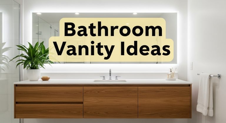
Bathroom
Crisp whites, pale blues, or gentle greens create a clean and refreshing atmosphere.
Dining Room
Deeper tones such as navy, olive, or charcoal add sophistication and intimacy.
Common Color Mistakes to Avoid
- Choosing paint before furniture and flooring
- Ignoring undertones
- Using too many colors in one space
- Selecting overly bright shades for large surfaces
- Skipping paint testing
- Mixing warm and cool tones unintentionally
- Following trends without considering long-term appeal
Each of these mistakes can disrupt visual harmony and lead to expensive corrections.
Expert Designer Tips for Choosing Colors
- Always view samples vertically on walls, not flat on a table
- Choose one consistent trim color throughout the home for continuity
- If unsure, go one shade lighter than your initial choice
- Matte finishes hide wall imperfections, while satin adds durability
- Dark colors work best when balanced with adequate lighting
- Repeat accent colors at least three times in a room for cohesion
- Natural materials like wood, stone, and plants help unify color schemes
These small professional techniques make a significant difference in the final result.
Advanced Strategy: Creating Depth With Color Layers
Professional interiors rarely rely on a single flat color. Depth comes from layering:
- Base neutral walls
- Mid-tone furniture
- Darker accent pieces
- Textured materials such as wood, linen, or metal
This layered approach prevents spaces from looking flat or unfinished.
Whole-Home Color Planning Checklist
- Identify fixed elements and undertones
- Select one main neutral
- Choose two coordinating secondary colors
- Pick one or two accent shades
- Test paint samples in real lighting
- Ensure color flow between rooms
- Repeat accent colors throughout the home
- Balance warm and cool tones
- Consider long-term flexibility
Following this checklist helps ensure a cohesive and professional result.