How to Use Color Psychology to Redesign Your Home Room by Room
Color isn’t just visual — it’s visceral. It can energize or calm, warm or cool, shrink or expand a space. And when used intentionally, it becomes one of the most powerful tools in home design. While trends may come and go, color psychology — the study of how hues influence human behavior and emotion — offers timeless insights into how we interact with our environment.
Redesigning your home with color psychology in mind means asking more than “what looks good.” It’s about asking: How do I want to feel in this space? Different rooms serve different functions — and therefore call for different emotional tones. Let’s explore how to use color to enhance the mood of each room in your home.
Understanding the Basics: Warm vs. Cool, Light vs. Dark
Before we break it down room by room, it’s helpful to understand a few foundational ideas.
- Warm colors (reds, oranges, yellows) tend to feel stimulating, cozy, and energizing. They’re great for spaces where socializing or activity is encouraged.
- Cool colors (blues, greens, purples) are generally calming, serene, and restorative. They’re better suited to restful or contemplative rooms.
- Light tones open up a space, making it feel airy and expansive. They can also evoke softness and clarity.
- Dark tones create intimacy, drama, and depth — though too much darkness can feel heavy if not balanced with light or texture.
That said, color is deeply contextual. The same shade of blue can feel icy in a north-facing room and tranquil in a sunlit one. Always consider natural light, orientation, and use of space when choosing colors.
Bedroom: Calm, Rest, and Restoration
The bedroom is a sanctuary for sleep and quiet. Here, color should support relaxation and a sense of security — helping lower heart rate, reduce stimulation, and ease the transition from waking to rest.
Best Colors:
- Cool blues (like powder blue or dusty teal) are widely regarded as the most calming. Studies show they reduce blood pressure and evoke peace.
- Soft greens offer a grounding, restorative quality — think sage or eucalyptus.
- Warm neutrals (beige, taupe, greige) promote comfort and warmth without overstimulation.
- Lavenders and muted mauves introduce a soft, dreamy quality without being overly feminine or cold.
Avoid:
Bright reds, yellows, or neons — these stimulate rather than relax. Even bold black or dark gray, while dramatic, can feel oppressive if not softened with texture and light.

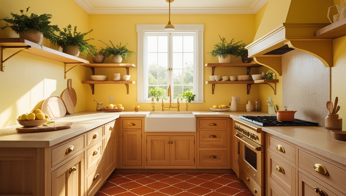
Kitchen: Energy, Warmth, and Appetite
The kitchen is often the most social and active space in the home — a place of nourishment and connection. Color here can stimulate appetite, encourage conversation, and reflect vibrancy and hospitality.
Best Colors:
- Warm yellows and golden tones mimic sunlight and spark happiness. Even pale yellow can lift a kitchen without overwhelming it.
- Terracotta and muted oranges boost energy and appetite.
- Soft greens work well in rustic or cottage-style kitchens and connect the space to food and nature.
- Creams, warm whites, and honey-toned woods feel welcoming and timeless.
Avoid:
Cold, clinical whites or steely grays can make kitchens feel sterile if not balanced with warmth. Overuse of red may feel too aggressive, although a pop of red (like a kettle or barstool) can be energizing in small doses.

Living Room: Connection, Comfort, and Versatility
The living room is a multi-purpose space — a backdrop for relaxation, conversation, entertainment, and family life. Color should strike a balance between inviting warmth and visual calm, supporting both social and solitary moments.
Best Colors:
- Greens (especially olive, sage, or moss) are versatile, grounded, and promote balance.
- Warm grays, soft taupes, and mushroom neutrals create an elegant, quiet backdrop for layering textures.
- Soft blush or muted coral can add warmth without overwhelming.
- Deep navy or forest green creates a cozy, cocooning feel when used on accent walls or in moody, modern schemes.
Avoid:
Extremely high-saturation colors or overly icy tones. Loud primaries can feel jarring in a space meant for relaxation and dialogue.

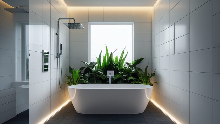
Bathroom: Cleanliness, Clarity, and Spa-Like Serenity
Bathrooms can be purely utilitarian — or they can offer a mini retreat. Color here should evoke clarity, purity, and lightness. But with the right palette, bathrooms can also become deeply soothing, spa-like environments.
Best Colors:
- Pale blues and aquas suggest freshness and calm — especially when paired with white tiles or marble.
- Soft grays and greige tones provide a clean, modern canvas for layering warm metals or textures.
- Muted seafoam or eucalyptus green brings a natural, refreshing element.
- Warm whites (never stark white) can open up small spaces and reflect light beautifully.
Avoid:
Overly bright or saturated colors, especially in small bathrooms. Harsh reds or oranges may feel overstimulating. Stark whites without any warmth can feel too clinical.

Home Office: Focus, Creativity, and Mental Clarity
In the home office, color must support sustained attention, creative energy, and mental flow. Different hues can be tailored depending on your specific work style — some people need calm to focus, others thrive with visual stimulation.
Best Colors:
- Muted blues and soft teals promote focus and clarity — ideal for concentration-heavy work.
- Warm whites or light grays offer a neutral backdrop that reduces distraction and allows decor or art to shine.
- Pale greens are associated with balance, refreshment, and reduced eye strain — especially helpful for long hours at the screen.
- Terracotta, clay, or muted mustard add warmth and creativity without chaos.
Avoid:
Bright red, intense purple, or high-gloss finishes, which can increase agitation or visual fatigue. Deep dark tones should be balanced with natural light or layered lighting.

Final Thoughts: Design That Feels as Good as It Looks
Redesigning your home using color psychology isn’t about rules — it’s about awareness. When you understand how color influences mood, you gain the power to shape your environment in ways that support how you want to live, work, and feel.
Think about the energy you want to invite into each room. Do you want your bedroom to feel like an exhale? Your kitchen to buzz with morning energy? Your office to keep you focused but inspired? Start with those emotional goals, and let the color palette flow from there.
And remember — lighting, materials, and texture all play a supporting role. The same sage green will feel completely different on matte walls in a south-facing room than in a glossy finish in a north-facing nook. Always test in context.